QR Studio
Logo in the middle of a QR code: how much room is actually safe
Almost every guide says the same thing — put the logo in the centre, where the spare modules are. There are no spare modules. Understanding what actually gets damaged explains why the safe size is smaller and more predictable than the folklore suggests.
Want to see how a logo looks on your own code?
Open StudioThe centre is not a storage area
A QR code carries its data in codewords — small groups of eight modules — spread across the whole symbol, interleaved in blocks. There is no reserved empty region in the middle and no padded buffer waiting to be covered. The centre looks empty only because it is far from the three big corner markers, so nothing visually anchors the eye there.
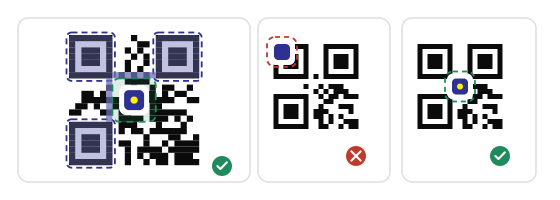
The centre is still the right place for a logo, but for a different reason: it is the part of the code furthest from the structural markers a camera uses to find and align the symbol. Covering it is survivable. Covering a corner marker is not.
What error correction actually counts
Error correction adds redundant codewords so the decoder can rebuild ones that are wrong or missing. It counts codewords, not pixels. Your logo covers a shape; the decoder counts how many codewords that shape spoils — and a single touched module spoils an entire codeword.
That is why the numbers on paper are more optimistic than reality. A logo with soft edges, a rotated angle, or a drop shadow touches far more codewords than its surface area suggests. A crisp panel snapped to the module grid damages the minimum possible number.
The four levels and what they really buy you
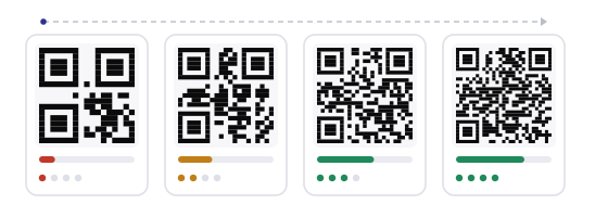
The percentages are the share of codewords that can be reconstructed, not the share of the printed area you may cover.
L — about 7%
The default on many generators because it produces the cleanest, coarsest pattern. No room for a logo. Fine for a code that is printed large and scanned close.
M and Q — 15% and 25%
M tolerates dust, a curved surface or a scratched sticker. Q is the sensible floor for a small logo, and the honest ceiling for anything printed under three centimetres.
H — about 30%
The only level that makes a real logo realistic, and the one to choose whenever the mark covers more than a tenth of the code. Still not permission to cover a third.
Rough rule from practice: use H if the logo is bigger than a tenth of the code, Q if it is a small monogram, and M only for a knock-out so small it barely counts. L plus a logo is a combination worth avoiding.
Area, not width — the number everyone gets wrong
The most common sizing mistake is judging the logo by its width rather than its area. Halving the width quarters the area, and the jump between a logo that works and one that fails is much smaller than it feels in the editor.
So the answer to «how big can the logo be» is usually smaller than it looks: a mark a third of the width is the practical maximum, and a quarter is the comfortable choice.
The parts you must never cover
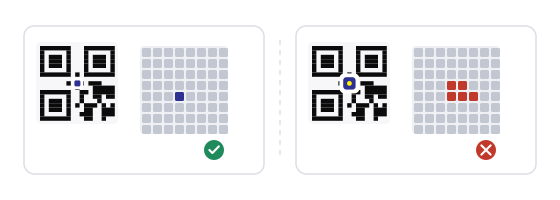
Three things in a QR code are structure rather than data, and none of them can be replaced by error correction: the three large finder squares in the corners, the alternating timing line that runs between them, and the small alignment square that appears in larger versions towards the bottom right.
A logo in the centre is far from all of these by construction. That is also why moving the logo off centre to balance a layout is riskier than it looks — half a centimetre towards one corner can be the difference between a decodable symbol and a dead one.
Give the logo a clean panel, not a hole
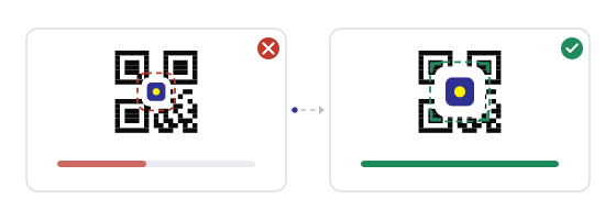
In the Studio, the most reliable approach is to knock out a solid panel of background colour — a square or circle — and place the logo on top of it. The panel edges become hard and predictable, which means the decoder counts a tidy set of whole codewords instead of a ragged fringe of half-touched ones.
Snap that panel to the module grid if the tool allows it. A panel that starts halfway through a module wastes an entire codeword on an edge that would otherwise have been clean.
How big that is in millimetres
Percentages do not help when you are standing at a printer. On a four-centimetre table card, a logo a third of the width is about 13 mm across. On a business card code of two centimetres, the same ratio gives you 7 mm — too small to read as a brand, and large enough to cost you codewords.
That contradiction is the real argument against logos on small formats: below roughly three centimetres the logo stops being recognisable exactly when it starts being expensive.
The artwork itself matters as much as the size
A solid silhouette with generous internal gaps survives. Thin strokes, fine serifs, hairline outlines and text inside the mark do not — they need a resolution the modules cannot give, and they turn into grey mush at print size.
Avoid transparency altogether. A semi-transparent logo blends with the modules underneath it, which is worse than hiding them: instead of a clean damaged region you get a region the decoder has to guess at. Export the logo as a flat, opaque shape on the panel colour.
Dense codes punish the same logo more
A short link produces a coarse symbol with large modules — forgiving, and a logo looks clean on it. A long URL, a vCard or a Wi-Fi payload produces a dense symbol with fine modules, and the same logo now eats more codewords relative to the print size.
Practical consequence: if you switch from a short link to a long tracking URL, re-open the file and check the logo again. Nothing else changed, but the code got harder to read.
When to drop the logo altogether
- Any printed code under two and a half centimetres.
- Codes that will be scanned from more than a metre away.
- Anything behind glass, under warm light, or printed on a curved surface.
- Legacy codes at level L that you cannot regenerate.
- Formats where the brand already appears twice on the same object.
- Any code where a failed scan costs money — tickets, payments, access control.
None of these mean the design is worse. A plain code inside a well-designed card still looks like the brand; the logo was never doing the branding on its own.
Common mistakes
- Assuming the centre contains spare modules that cost nothing to cover.
- Measuring the logo by width and forgetting that area grows with the square.
- Keeping the generator's default level L and adding a logo anyway.
- Using a semi-transparent PNG so the modules show through.
- Dropping the logo on without a knock-out panel, leaving a ragged fringe of spoiled codewords.
- Judging the result in the editor instead of on a printed sheet at real size.
How to build it in practice
In the QR Studio, set the error correction level before you add the logo — H if the mark is more than a tenth of the code — then size the logo until it is about a quarter of the width and stop there. Keep it dead centre and let the panel edge land on the module grid.
Test the result with the QR scanner at real size, in the light where the code will live, on the oldest phone you have. And if the destination may change later, a dynamic code saves you from regenerating and reprinting the whole design.
Next steps, ready to use