QR Studio
QR design in the Studio: using every control without breaking the code
The Studio puts about six design controls in your hands, and they behave very differently. Two of them change only how the code looks. The other four change how much margin the decoder has left — and the preview will never tell you when that margin runs out.
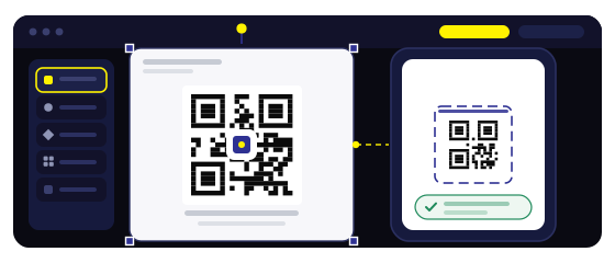
Want to try module shapes and colours live?
Open the StudioOne rule sits underneath every choice
The QR standard does not care about your brand. It asks for a pattern that is clearly darker than the background, with enough difference that a camera can still separate them in poor light. Everything else — colour, shape, gradient — is a decoration on top of that single requirement.
So the useful question is not «is this colour on brand» but «how far apart are these two colours in brightness». A deep navy on white is far apart. A brand orange on a cream background is close together, and no amount of design confidence closes that gap.
The contrast check that needs no tools
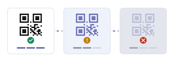
Three ways to test the same thing, in increasing order of honesty. Squint at the code from a metre away: if the squares merge into a grey blob before you lose the rest of the layout, the contrast is thin. Then photograph the code with your phone and turn the photo black and white — if the code almost disappears, so will it in a dim room.
The third test is the only one that counts: open the preview on the oldest phone in the building and scan it at the distance it will really be scanned from. Two seconds without a retry is a pass. Five seconds and a second attempt is a design that needs less decoration, not more.
Module shape: the control with a size limit
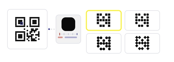
Squares, rounded squares and dots all encode the same data. What changes is how much ink each module puts on the surface, and how much of that ink a camera can still see at a small size.
The pattern here is simple: the more ink a style removes, the larger the code has to be to compensate. A dot pattern on a table card is fine; the same pattern on a business card is a gamble you do not need to take.
The three corner squares are structure, not decoration
Every QR code carries three large square markers that tell the camera where the code is, how big it is and at what angle it is tilted. They are read before any of the data. Style them too aggressively and the code fails at the very first step, which is why a code can look beautiful and stubbornly refuse to scan on one particular phone.
Rounding the outer edge of those markers is safe. Turning them into thin outlines, hearts, leaves or letters is not: the decoder needs a solid dark centre to lock onto. If you want a themed marker, keep the centre filled and change only the outline.
Gradients: fine until the light end reaches the background
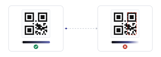
A gradient across the modules is one of the few effects that costs nothing — as long as the lightest part of the gradient is still clearly darker than the background. A blue that fades from deep to mid looks good and scans well. A blue that fades into pale sky does not: one corner of the code has quietly become background.
The direction matters too. A vertical gradient usually keeps its darkest area where the eye and the camera need it. A diagonal that ends pale in a corner is the version that fails, and it fails on exactly the phones you cannot test.
Backgrounds: what you export is what you get
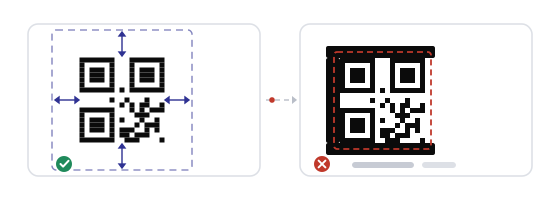
The single most common Studio mistake is a transparent background. It looks clean in the editor and on a white web page, and then the code is dropped onto a coloured poster, a dark menu or a photo — and the code is now dark-on-dark. Transparency is not a feature here, it is a deferred problem.
Export with the background baked in, in the light colour you actually intend. And never place the code on a photograph or a pattern without a solid light panel behind it: the camera needs the quiet zone to be genuinely empty, not merely calm.
The quiet zone is a design element too
The Studio lets you set the padding around the code, and setting it to zero is the fastest way to produce a file that looks tidy and scans badly. Four modules of empty space on every side is the minimum, and on a small format that is only two to four millimetres.
Treat that margin as part of the design rather than wasted space. A code with a generous margin looks deliberate; a code pressed against a border looks like it was cropped by accident, which is usually what happened.
Brand colours, sorted into three groups
Most palettes contain a colour that works, one that is marginal and one that should never touch a code. Sorting them once saves the argument every time a new campaign arrives.
Works as is
Navy, forest green, burgundy, charcoal, deep teal. Dark enough to sit far from white, and still recognisably the brand.
Works with a darker shade
Brand orange, mid-blue, warm red. Pick the darkest version in the palette for the modules and keep the background pure white or a very light tint.
Keep away from the code
Pastels, pale yellow, light grey, anything that needs a caption to be seen. Use them on the card around the code — the layout still carries the brand, the code carries the data.
That last point is worth stating plainly: brand consistency does not require the code itself to be the brand colour. It requires the whole object to look like the brand, and a scannable code on a well-designed card does that better than an unscannable one in the right shade.
Effects that look better than they print
Drop shadows, glows, bevels and heavy frames all add pixels around the modules, and the decoder reads those pixels as noise. On screen at two hundred percent they look considered; printed at four centimetres they turn the edges soft.
The same goes for shape: a code inside a circle, a heart or a bottle silhouette loses the corners the camera uses for alignment. A decorative shape around the code is fine — a decorative shape cut out of the code is not.
Design for the place, then for the screen
A design that works on a website hero often fails on a laminated table card, and the reverse is also true. Before choosing colours, decide where the code will live: under warm restaurant lighting, behind glass in daylight, on a phone screen at night, or printed at two centimetres on recycled card.
Two constraints come out of that decision almost every time. Warm light flatters warm colours, so an orange that looks rich at home can look washed out at the venue. And anything behind glass needs more contrast than anything on paper, because the reflection adds a second, lighter image on top of yours.
Common mistakes
- Exporting with a transparent background and placing the code on a dark surface.
- Styling the three corner markers into outlines or shapes until nothing anchors the code.
- Using dots or thin modules on a small printed format.
- A gradient whose light end is nearly the same brightness as the background.
- Setting the padding to zero for a cleaner look.
- Judging the design in the editor at two hundred percent instead of at real size on a real phone.
How to build it in practice
In the QR Studio, start from a template rather than a blank canvas — the templates already keep the corner markers and the margin intact, which is most of the work. Change one thing at a time, and after each change look at the code at the size it will actually be used, not zoomed in.
Then test with the QR scanner on the real device in the real place, and remember that a dynamic code lets you replace the destination later without redesigning the object the code is printed on.
Next steps, ready to use